I spearheaded the creation of a modern, user-friendly digital experience for Ergo. By completely revamping the UI.
My role
IA
UI
Prototyping
Sector
Finacial Services
Life Science and Pharmaceuticals
Public Sector
Ergo is a medium-size Ireland-based provider of IT solutions and IT consultancy.They specialise in cloud-based IT, data security, and practical business consultancy around hardware and software installation.
The client (Ergo) wanted to redo their main marketing website. Their main design and UX requirements included;- Modernise the UI to help the company fit into the high-tech marketplace- Introduce UI styles (type styles, colours, border radius etc) - to reflect their new logo and brand image- Responsive designs to cover desktop, tablet, and mobile layouts- Restructure the sitemap and reorganise the content to create a more navigable user experience- Populate the design with image content to help give the company a relatable human face.
A client workshop was facilitated and my role was to categories this information.
Several topics were discussed and documented, including:
The client’s goal - of becoming more prominent in the IT market through their website
The main kinds of website visitor - including SMB owners, government bodies, and C-level business executives
Their desired market perception - of being a one-stop IT solutions shop
Their main obstacles - including their legacy website’s poor performance on the IA front

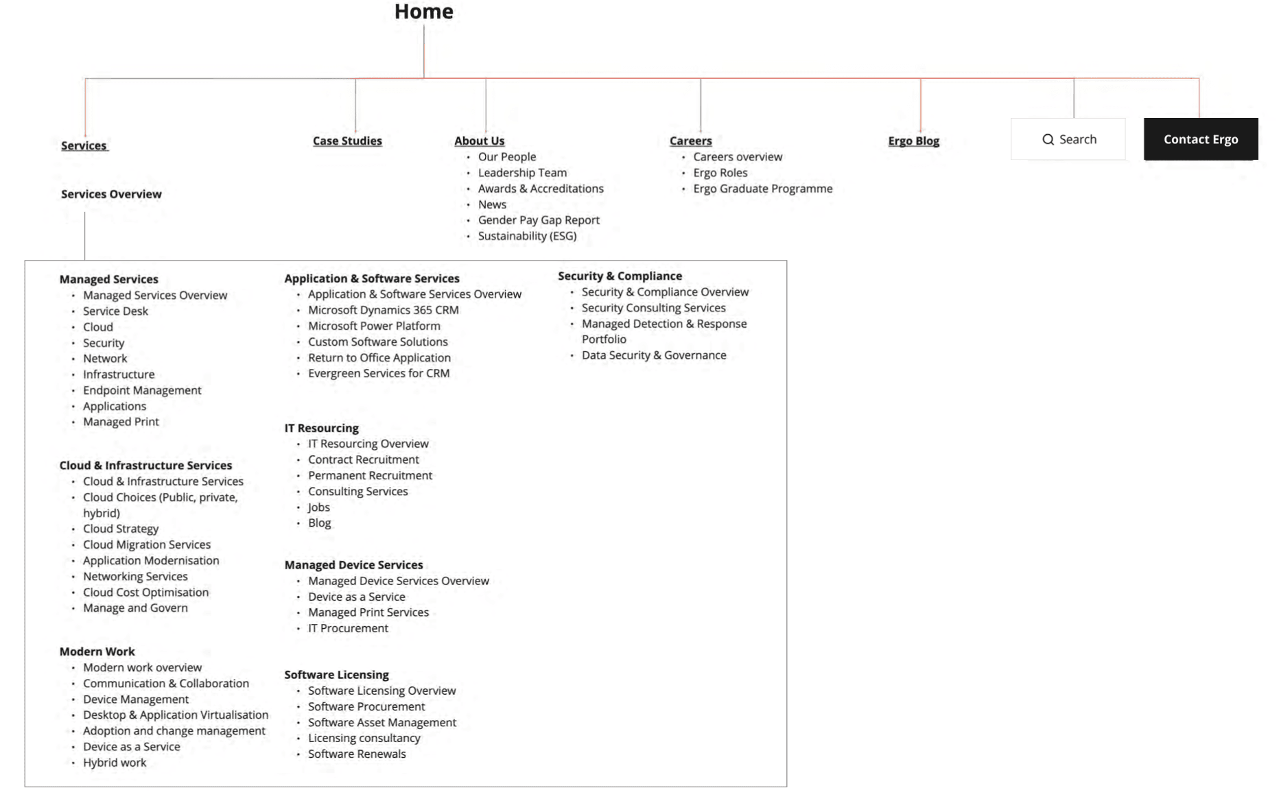
My second responsibility entailed developing a sitemap of Ergo's existing website as a preliminary step in crafting a more streamlined information architecture. Upon analysis, it became evident that the current navigation structure was overly intricate and challenging for users to navigate effectively. To address this, I conducted a benchmark analysis, examining the navigation strategies employed by leading companies in the IT industry. This comparative study illuminated common attributes and best practices, providing us with valuable insights to better align Ergo's site with industry standards. I mapped out a new sitemap - which featured a shallower, easier to navigate page hierarchy where content was easier to locate and consume.
Before starting the Ideation phase of the project, I did a UX Audit on the existing site. Looking at components used and generative AI heatmaps with predictive eye-tracking to look for cognitive overloads. Which gave me a grasp of what worked, what didnt and what I need to improve on from the previous solution.

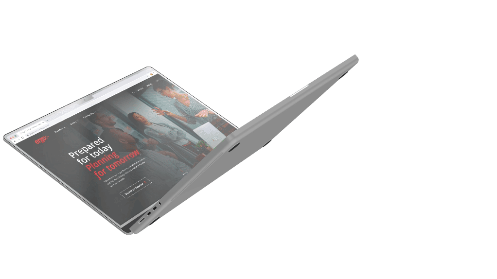
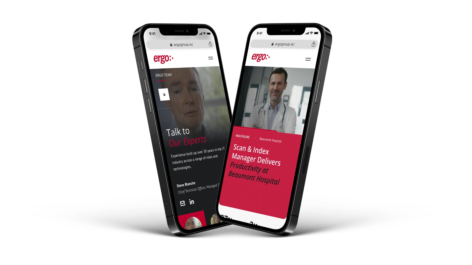
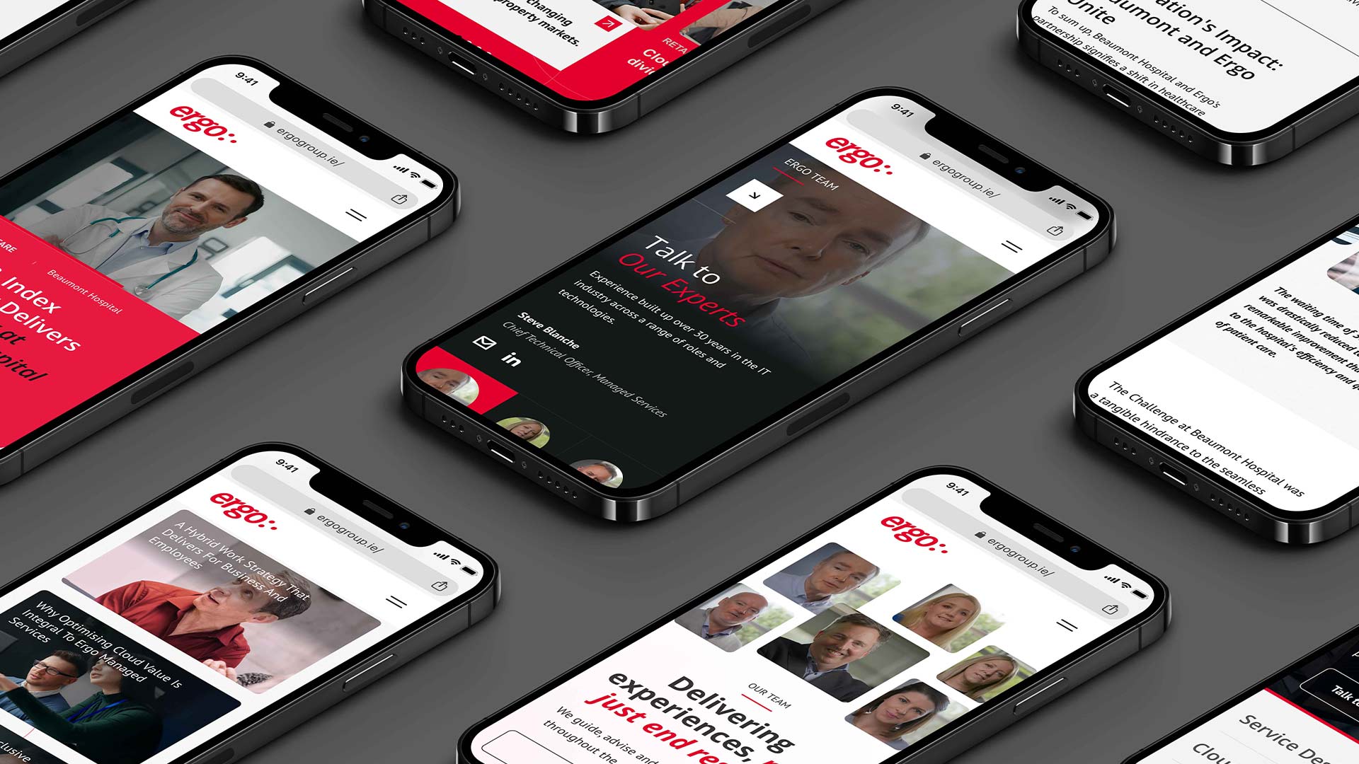
After securing client signoff on the information architecture, I was assigned the design of four key UI templates, encompassing a total of thirteen individual components.I incorporated images of friendly faces working at computer stations to bring a human feel to the interface.I also created interactive prototypes for each page template, where I added a layer of realism through the use of micro-animations - which enhance the user experience. I used Figma for the UI work, and Photoshop and Remini for image editing.I made the suggestion to the project team and the client to conduct some qualitative usability testing on the designs. I do recommend this as part of any design process as a means of validating designs before build. However, the client decided to proceed without this step due to budgets and deadlines.
Following the development of the prototypes, I presented them to the client for review.While they expressed overall satisfaction, they requested specific refinements, such as softer edge treatments to better mirror the curvature in their logo, as well as the incorporation of additional visual cues like circular elements that echoed their branding.Subsequently, I implemented these changes, garnering client approval for the updated design.
“We are delighted to launch our refreshed website and visual identity to our Irish and global client base, reflecting the evolving nature of Ergo’s business model as we continue on a path of rapid growth and expansion."
By the end of the project I had created:
A set of four key website page templates with a new, modern style (reflective of the client’s new brand styles), covering desktop, tablet, and mobile layouts
A humanised user interface to help warm prospective customers to the business
A restructured sitemap with reorganised content and a simplified navigation
I handed over the final Figma file and the updated sitemap to the client for them to take into production.
I enjoyed the iterative process, consistently refining and visually translating the client's vision and proposition through engaging workshops and ongoing dialogue. Steering the project visually, I relished the challenge of devising innovative solutions that not only met but exceeded the project’s requirements. If I could approach the project any differently Ideally, I would have conducted user testing to validate the navigation design choices. However, due to resource limitations, this wasn't feasible within the project's timeframe and budget.